Smarter Balanced
Complex testing tools, easier for everyone.
Designing tools, data, and experiences to support measured learning.
- Client
- Smarter Balanced
- Engagement
- Contract · Fairway
- Role
- UX/UI DesignDesign Direction
- Website
- smarter
balanced.org - Scope
- Assessment UI/UXData IllustrationReport DesignAccessibility
01
Design during discovery.
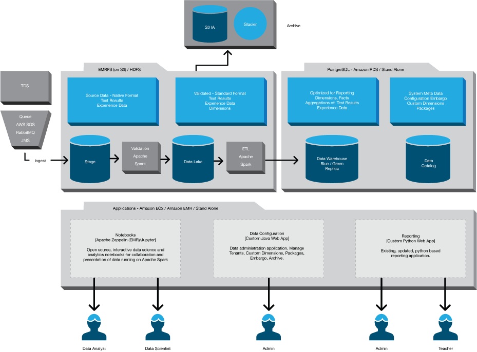
Behind every student assessment is a complicated system for collecting, processing, and reporting data.
I worked with the engineering lead to organize and illustrate an existing database architecture diagram. We collaborated to make sure the flow was accurate and easier to understand.
The final illustration gave the client a much clearer view of how everything worked together.
02
Organizing assessments.
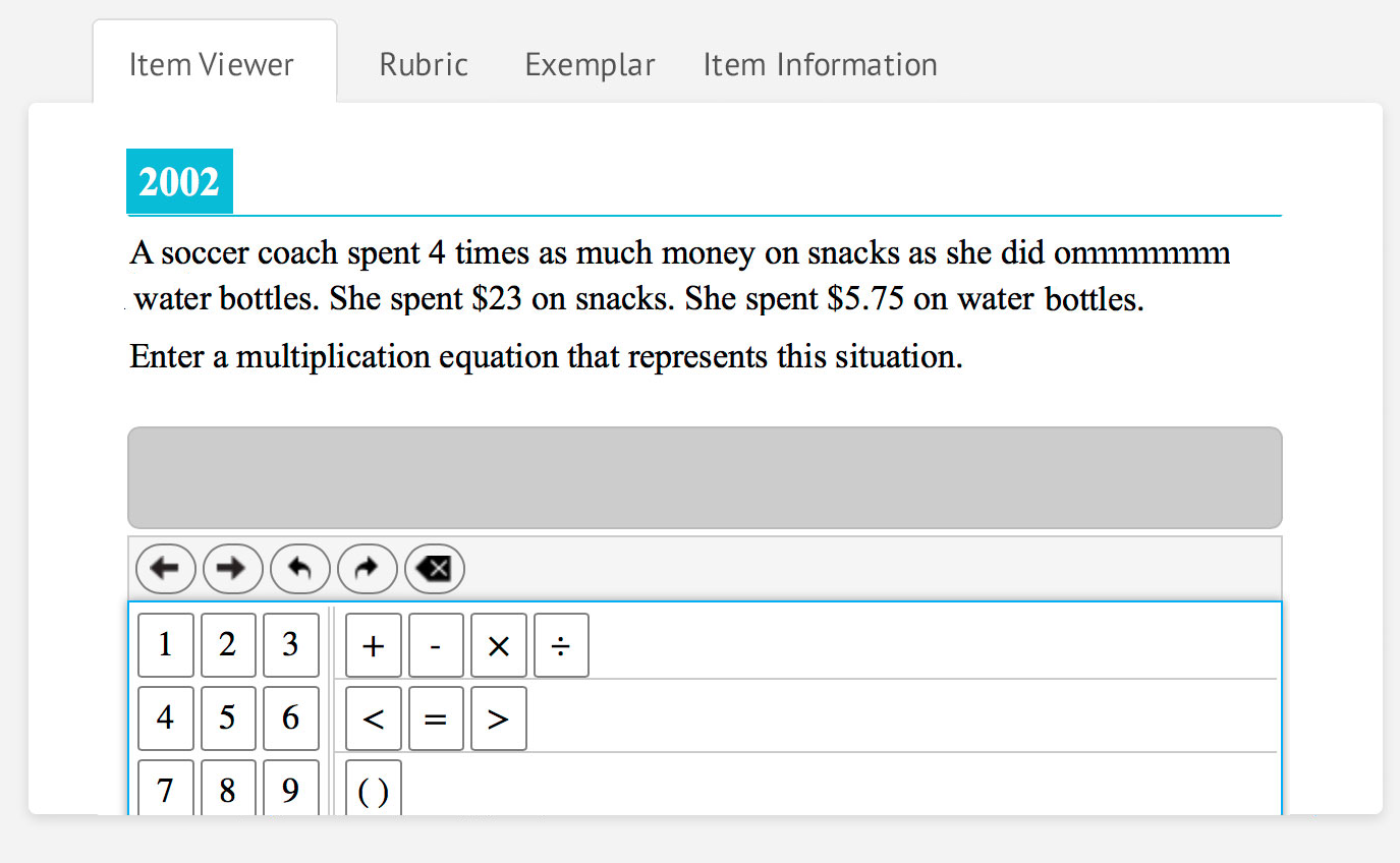
Assessment questions and their supporting information lived in different parts of the system.
I designed a new interface that brought the questions, scoring rubrics, exemplars, and item details into one place, making it easier for users to find and work with everything they needed.
03
Turning data into understanding.
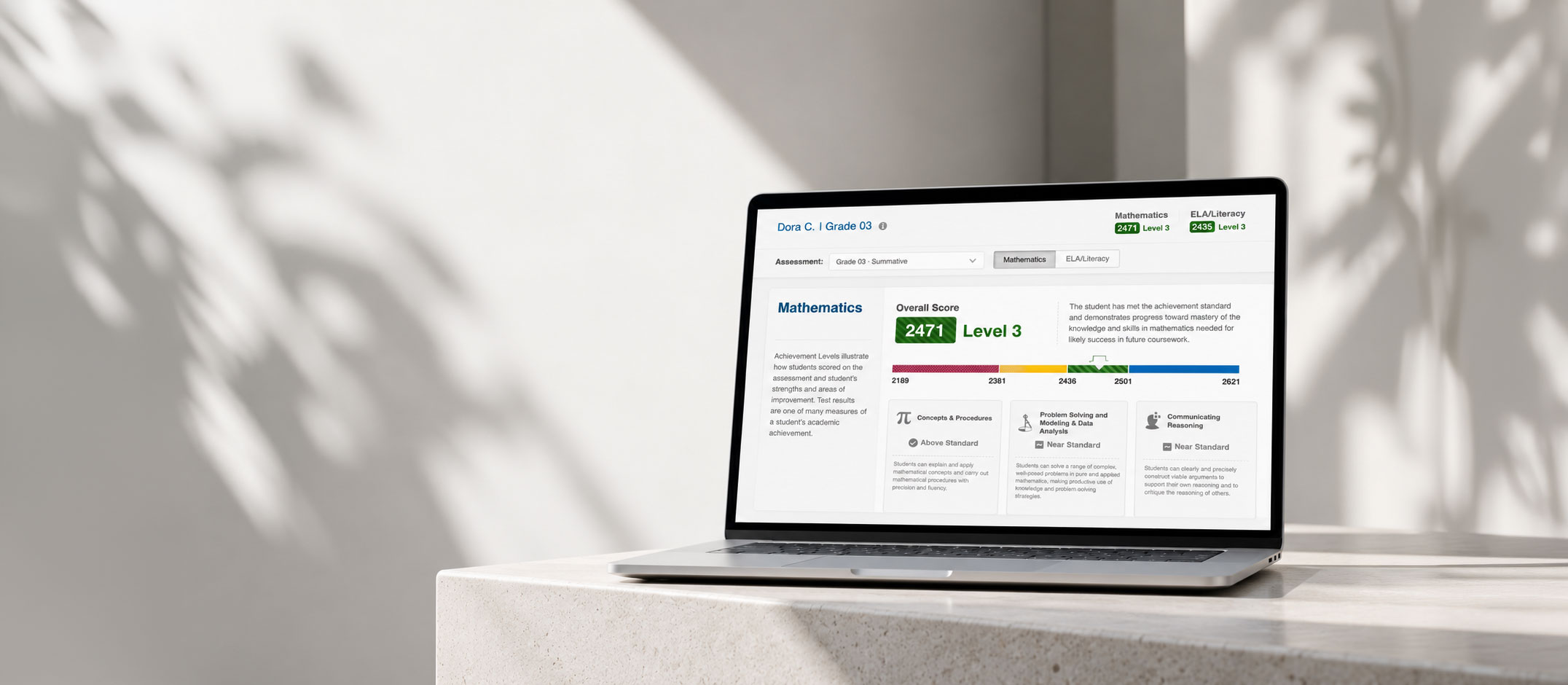
Once the tests were completed, the next challenge was helping people understand the results.
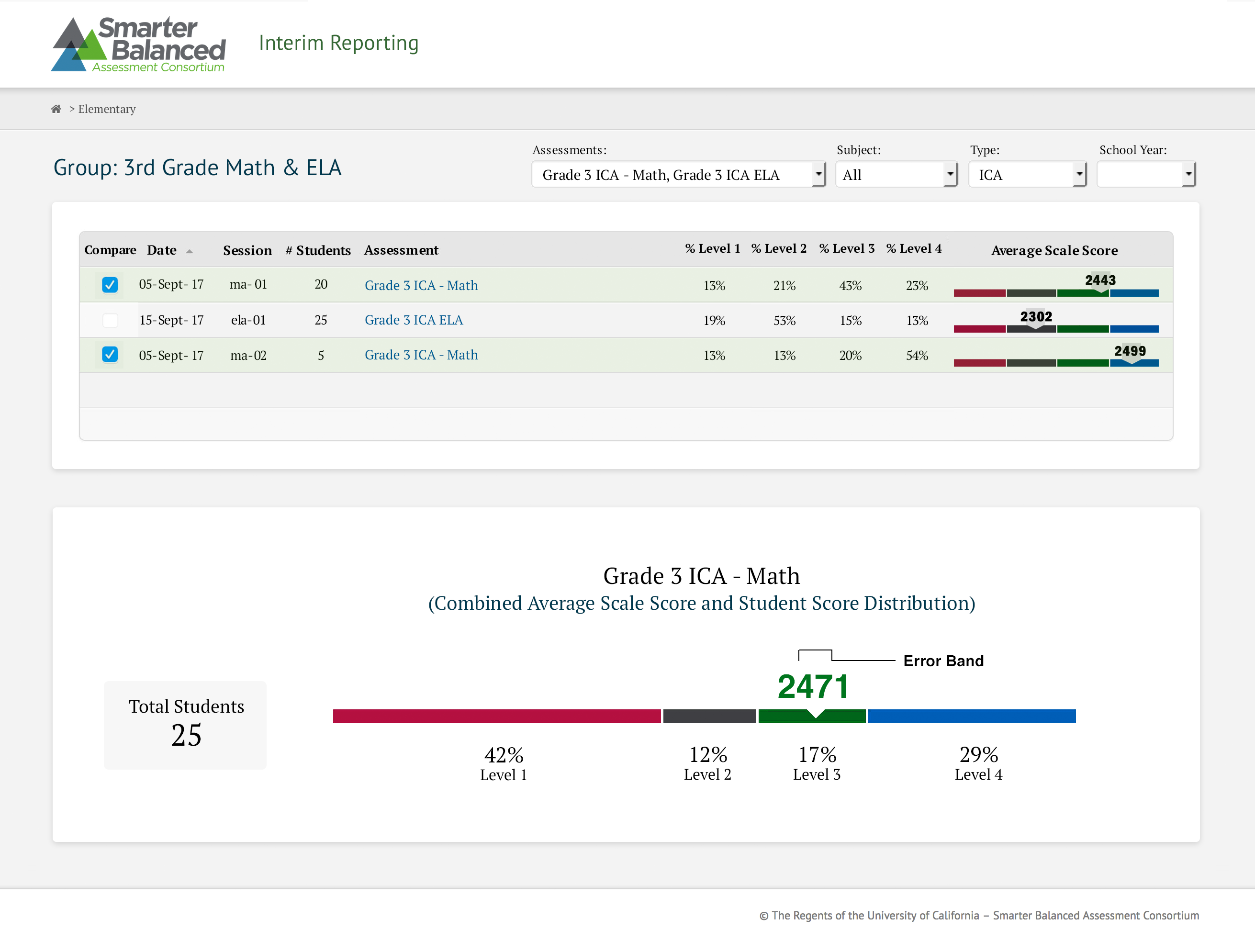
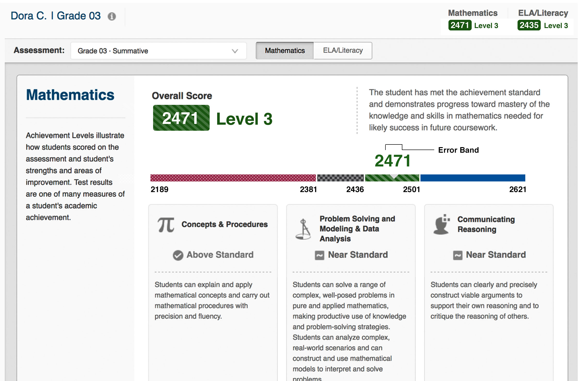
I designed report for teachers and parents, each with very different needs. Teachers needed to compare scoring across courses and identify where students need support. Parents needed a clear picture of their child’s progress and what the scores meant.
04
WCAG Colors.
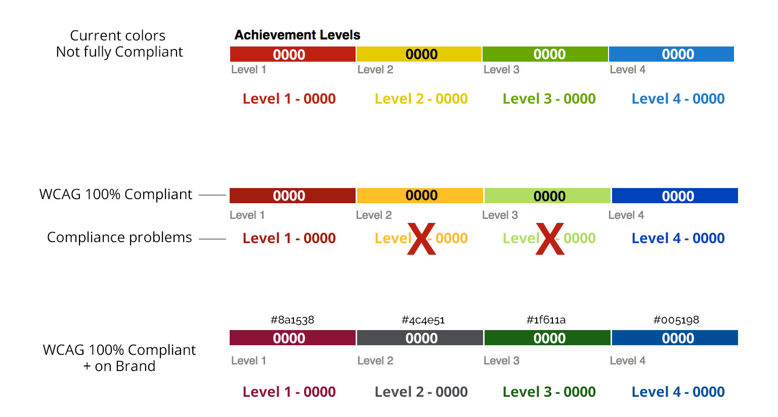
The brand colors weren't ideal for charts, and besides lacking contrast, it was rigid to force them into the UI.
I found a more accessible palette backed by research. There was some hesitation about associating colors with good or bad performance, but ultimately we agreed that familiar color cues made the results easier to understand.
05
Project growth.
As the Smarter Balanced projects grew, I brought in more of the design team, delegated projects, and led design reviews to keep the work consistent.
I stayed hands-on throughout, working directly with engineering, designing interfaces, and helping my team tackle some pretty complicated design challenges.